mobile app design trends 2017
Modern trends are always behind the development process in any field. Trends are influenced by cultural and technological backgrounds and make rules that a particular industry follows. Mobile app design is not an exception. When it comes to the biggest mobile app design trends in 2017, they are introduced as the new operating systems or the appearance of newly launched portable devices. The main aim of mobile design is to provide intuitive and engaging interface provision. The design needs to make the user feel comfortable and not interfere with the user's experience.
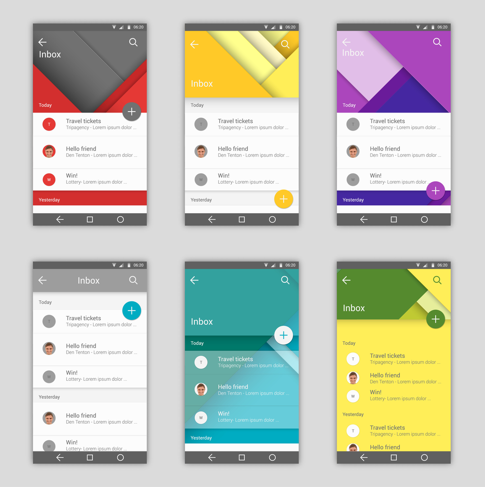
Material Mobile Design

The introduction of this mobile app design trend was in 2014 at Google's I/O conference. The trend has been catching on quite well, especially since it is aimed at making it easy for a user to engage with different mobile platforms. This design traces its origin back to what was known as the flat design. Over time, the material design has changed due to the addition of features taken from other designs.
When compared to other trends, material mobile design boasts the ability to provide better user experience and cleaner schemes that come with increased functionality, clear iconography, and simple coloring. All these work positively towards providing easier interaction. To see a good example of material design at work, you can have a look at all the major apps by Google. The apps include YouTube, Gmail, Google Drive, and Google Maps, among others. These apps are available for iOS and Android.
Functional Animation

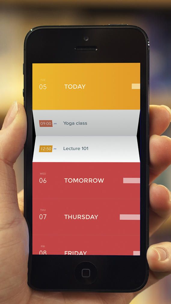
Also known as motion app design, functional animation is used by expert UX and UI designers to immerse users in the interaction process where they develop their own expertise. This design trend is not just about the creation of animation just to have animation. There is more to it, such as providing entertainment in a logical way. As opposed to material design, functional animation will not limit a designer in terms of creativity. The trend can be implemented across devices using different operating systems and comes with features that follow a certain practical goal.
If you are interested in making your user experience more dynamic, engaging and interactive, you might want to consider using delightful features such as zooming, visual effects, and animated response among others. The main reason designers use functional animation is to provide a fun, entertaining interaction that improves your user experience and benefits your website.
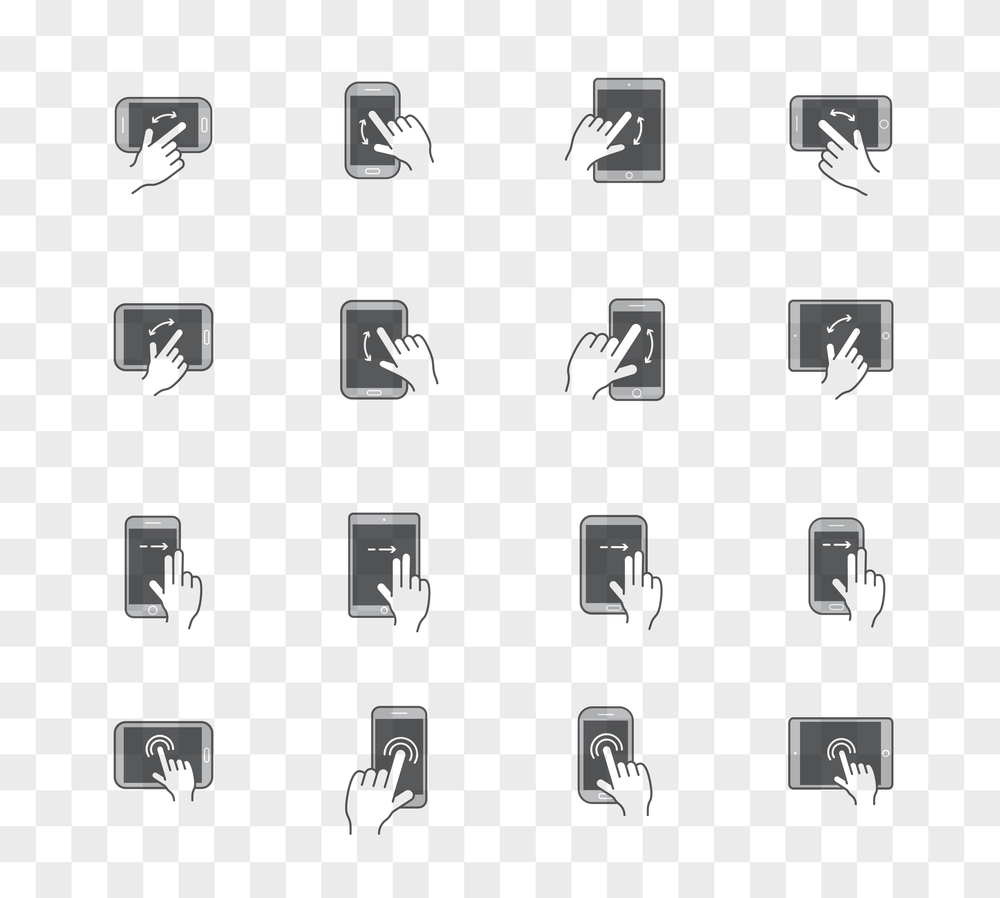
Swipe Navigation and Card Layouts

Card layouts are some of the great ways you can improve UX by making it more dynamic and interactive. This trend made its first appearance in 2014 and has been doing quite well, which is why it has made it to this list. Immediately after its debut, it went on to be an important trend and has expanded and shaped UX standards. The aim of this trend is to change the focus of designers from visual aspects to functionality.
The cards are geared towards the grouping of vital information in boxes that are separately outlined, to make it easy to access the information. If reviews are anything to go by, this trend is making things easy for users by giving quick access to vital information.
Designers in the modern world are offering a wide range of layouts. These layouts differ in type and form. Some of these layouts are presented as social network feeds and boards. A good example of card layouts is on Twitter, Facebook, Trello, and Tinder, among others. This trend has led to the convenience of swipe-based stacks. The user will have an advantage because they only need one tap to access additional content, and the cards are easy to navigate.
New Means of Navigation
New devices come with new challenges. Phablets came with their own challenges for UX and UI designers to deal with. Users get a chance to use larger screens, but this also means that the way they hold the device has changed, which calls for a different approach by UI/UX designers. The aim of new navigation means is to make sure that the user can scroll and tap comfortably on different devices. UX designers can work on the additional modifications to make sure that users are having an easy time navigating through a website on different sizes of screens.
Wearables
When you talk about mobile app design, you should not limit your consideration to phablets, smartphones, and tablets- there are also wearable devices. These include glasses and smart watches. These devices have taken the market by storm and positioned themselves in the digital market. Statistics state that more than 200 million wearable devices will have been sold by 2019. This indicates that they are devices designers do not want to ignore. Designers will have to work extra hard to come up with creative mobile app trends that will make wearable devices interesting for users.
Typography
The elements that appear on a screen need to follow a hierarchy. Headlines and paragraphs should be linked to guide the user from one part of the content to another. Since there are many devices being introduced every day, designers need to find ways to display content in such a way that it can be viewed on these different screen sizes.
Colors
White and subtle backgrounds have been the in thing for a long time. Today, there are changes in mobile app design since designers have adopted trends that use vibrant colors and darker backgrounds. Different colors highlight the position of different elements in the hierarchy. Designers should be creative here and consider factors such as the time of day, since darker colors are best suited for the dark.
Conclusion
These are the biggest mobile app design trends in 2017 that you need to watch. However, there might be others that are not on this list and this does not mean that they are not big. We expect to see new trends as the year progresses. The most important thing is to remain updated to provide the best user experience.
Topics:
mobile app development, mobile, mobile ux, mobile ui
Opinions expressed by DZone contributors are their own.
mobile app design trends 2017
Source: https://dzone.com/articles/biggest-mobile-app-design-trends-in-2017
Posted by: lawsontheast.blogspot.com

0 Response to "mobile app design trends 2017"
Post a Comment